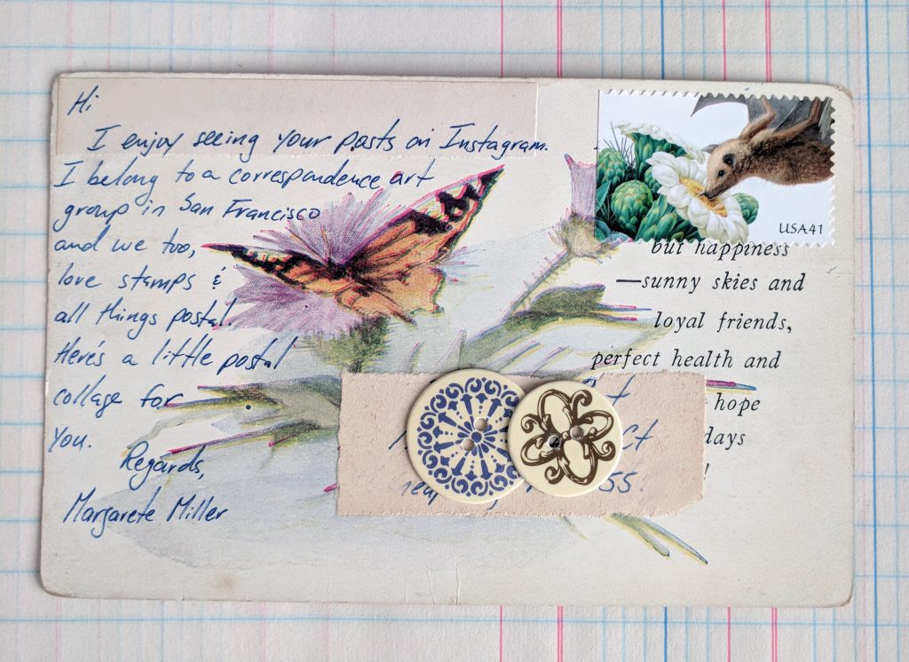
How to use a postcard as the basis for a collage
In my recent blog post on letter envelopes, I provided several finished examples of vintage collage art on covers. If you were wondering how I use a postcard (or letter) as the basis for a collage, I've posted some process photos with an explanation of what I often see when I put a collage together.
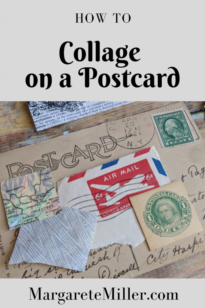
Postcards make a great substrate to begin a collage for the following reasons:
- the over all tone of the collage is established
- a basic color palate already exists
- elements on the postcard can be worked into the collage
Let's look at them one by one. Here are the two sides of my sample postcard:
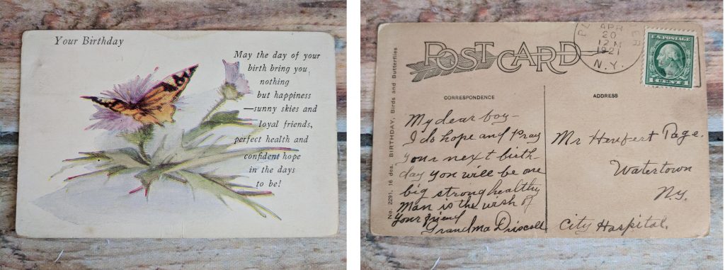
I chose this card because even though it was a nice thing to do in writing her grandson while he was in the hospital, the text or writing isn't very unique. I do, however, like the bright, clean stamp, the legible postmark, the design of the "postcard" header, and the yellowed-color of the paper. The front has a pretty illustration with a nicely printed sentiment, and there's plenty of white space for me to write something if I wish.
Do I use originals or reprints of a scan? Most of the time I use originals. I specifically look for postcards to add to my collection that are not very attractive and often boring. I prefer to use originals but wouldn't turn down an interesting reproduction.
Over all tone
The over all tone of this card is clearly vintage. I don't need to distress anything on either side. I can choose to add paper elements on top that are also vintage to keep with the same tone, or I can choose papers that are from a different era but that will blend with the postcard. First, I look through some paper scraps and start to lay things down on my postcard, seeing what colors and styles work.
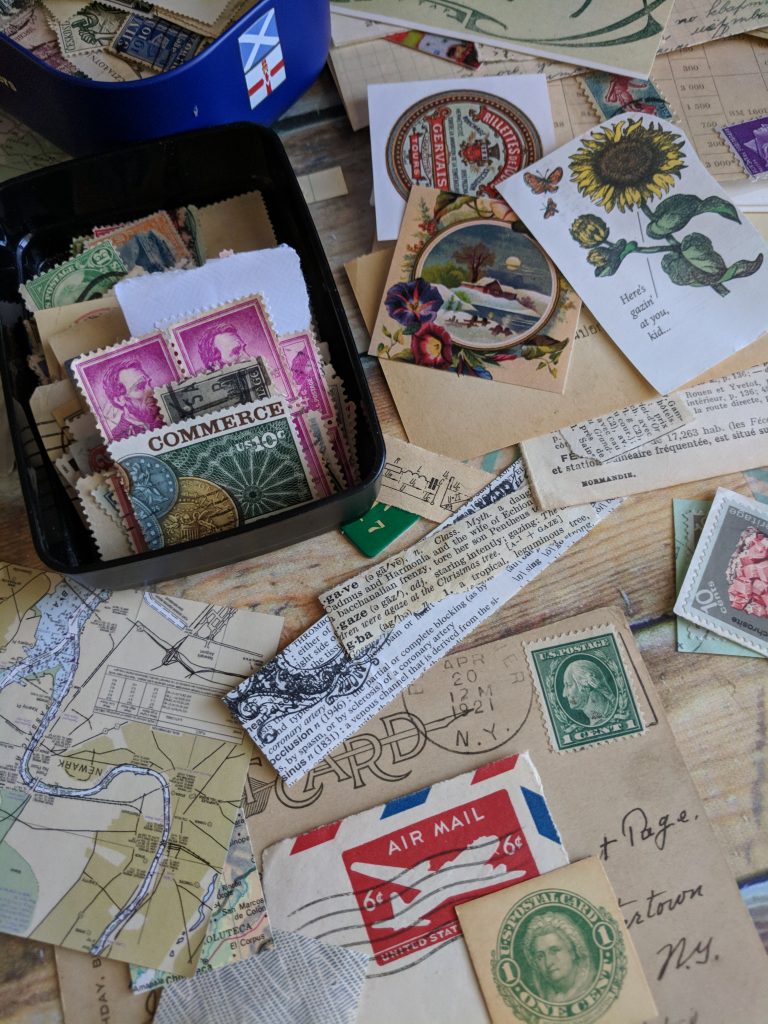
Below is what I initially came up with. Looking at this first layout, I see a couple of gaps of too much blank space -- just to the right of the red air-mail stamp, and just below that same red stamp. I'll focus on those spots later.
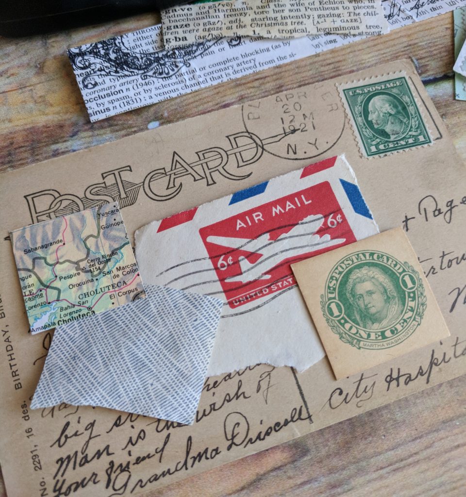
Though this postcard is postmarked 1921, I decided that I wouldn't try to keep my paper elements from the same time period. I decided that I would use several pieces of mail ephemera, and blend them together. The map goes along with mail ephemera because mail travels from point A to point B.
Color Palette
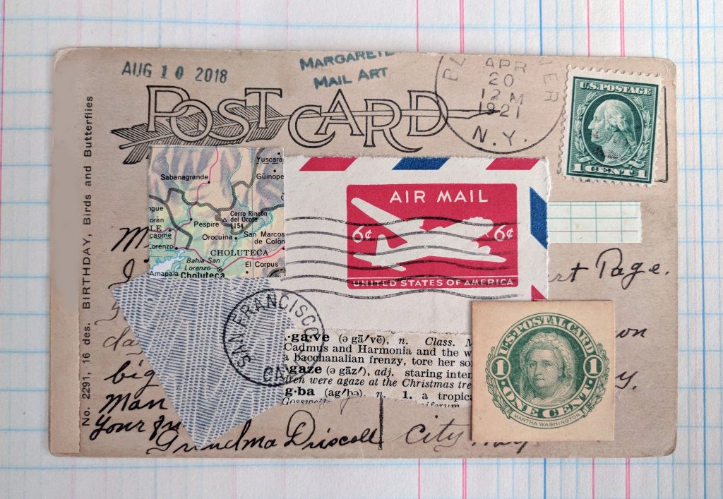
The colors of most pieces are neutral. What stands out the most is the piece of airmail envelope with the red stamp. The reason why that piece is not overwhelming or jarring is because it is such an obvious representation of postal ephemera and it fits well with the "postcard" theme. The two green stamps above and below, as well as the green in the map, help to keep the red piece balanced between the triangle.
Working with what's already there
I want some of the handwriting to still be visible to show that someone actually mailed this postcard in the past. Of course I want the original stamp and postmark to be clearly visible, especially because there is a date on the postmark. Lastly, I want the "postcard" lettering to be visible. Mostly I want it visible because it's an interesting font.
For those blank spots I mentioned earlier, I placed a small piece of green-ish ledger paper to the right of the red stamp. Below the red stamp I placed a piece of text and used a rubber stamping of a San Francisco postmark where the three pieces of paper intersect. The circular shape balances with the initial postmark, and with the green round stamp on the bottom right.
For the front, I did the reverse of what was initially intended - I used the front side to write my note, address it, and put the proper postage on it (postcard rate, 35 cents). Luckily I had a nature-themed stamp that mostly worked with the illustration.
Then, I mailed it. :-)
