
Thoughts on the ATC postcard swap

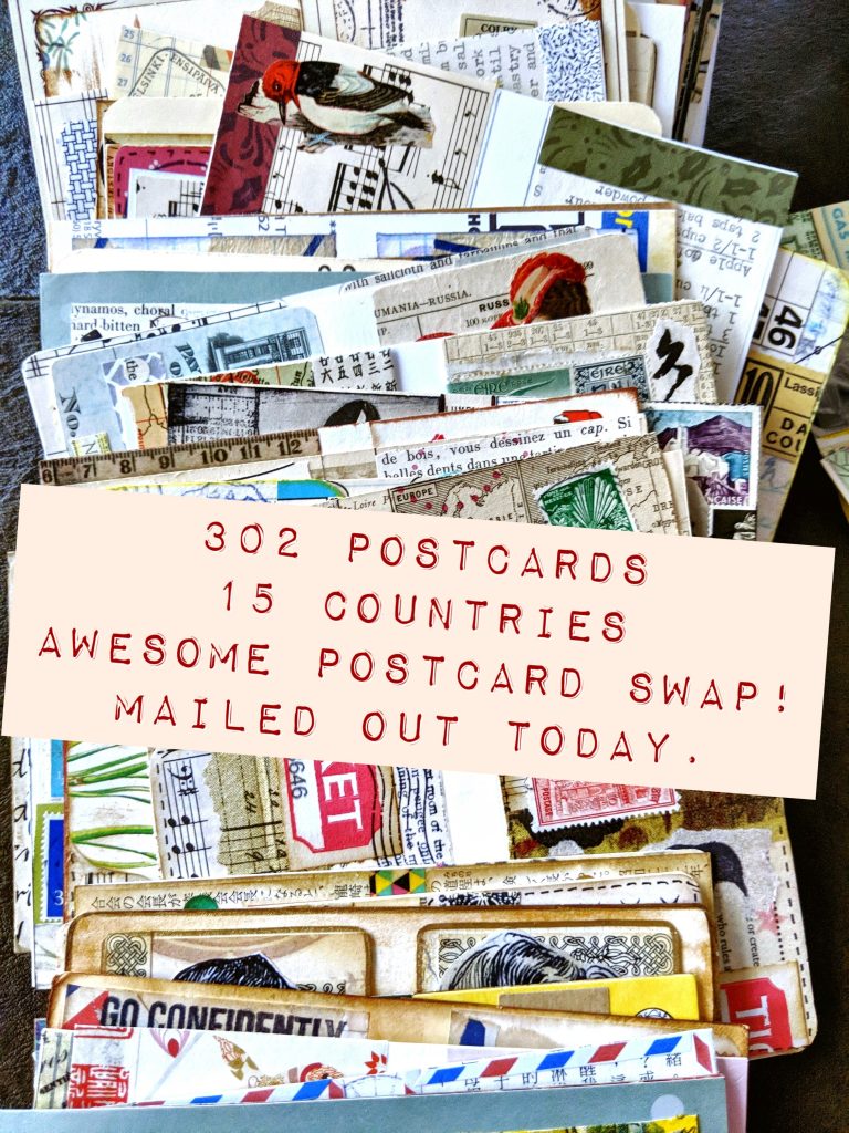
The postcard swap for summer 2019 -- the vintage ATC postcard swap, is done, and all cards have been mailed out. I did, however, want to provide some thoughts, as well as share some photos of postcards. I'll also explain why we won't be doing another of these kinds of swaps going forward.
The bad news first
Since starting postcard swaps last year, the primary kind of postcard we have been exchanging has been a 4" x 6" - sized card with a single collage done in a vintage style, such as these ones done for the "love" theme, back in January.
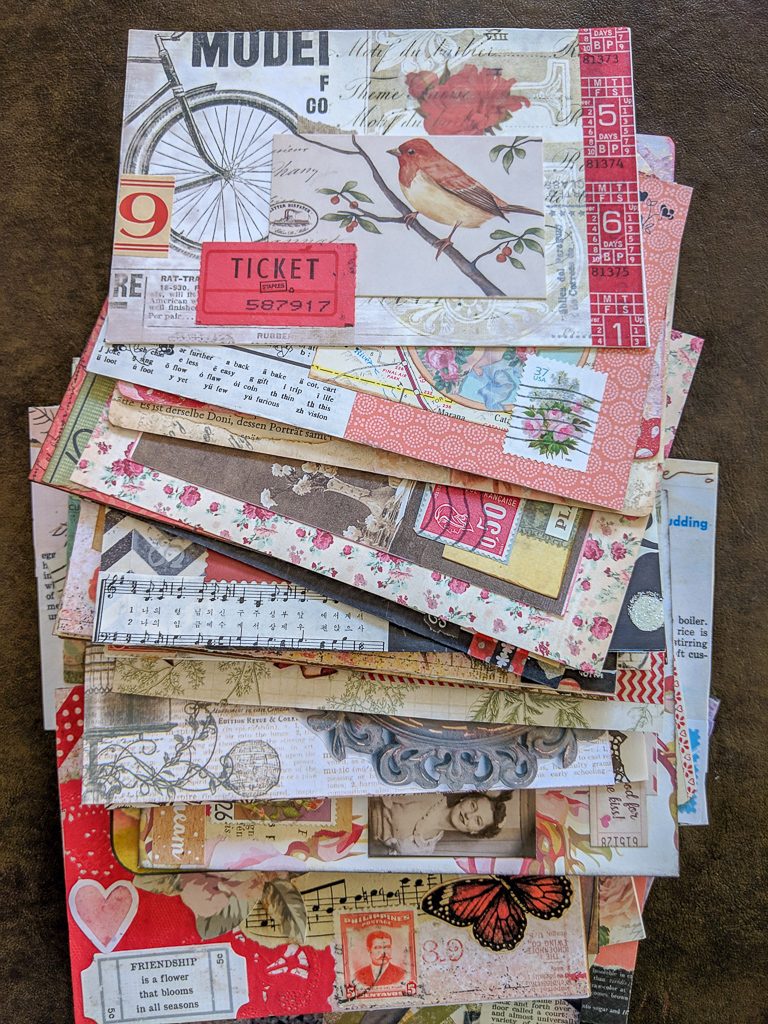
For this latest theme over the summer, the assignment was to create two ATCs (artist trading cards) on a single postcard, which would then be exchanged and mailed out. Since ATCs are often created on something the size of a playing card, many people glued (or attempted to) slick-surfaced playing cards onto paper cut the size of a postcard. The result were that roughly a fourth of the submissions had one or both of these problems:
- floppy cards that wouldn't hold the weight of the ATCs, and would bend in the middle
- ATCs that would easily become unstuck to the postcard
As I was attaching postage and address labels, I checked to make sure ATCs were attached firmly to postcards, but I could see that potentially, several postcards might not make it in tact, even with me fixing as much as I could. Some postcards were simply un-mailable, and I had to put them into individual envelopes to be mailed, rather than go as a postcard. I spent a couple hours fixing problem postcards, and finally I had to decide enough was enough; a card would reach its destination, or it wouldn't. Bottom line, we won't be doing ATC postcards again in the future. Only a single collage on a postcard.
General advice for creating postcard-sized paper collages
This might be a good time for me to go over some good practices for creating postcard collages that will be going through the postal system.
- Start with a good substrate. Image you are holding a postcard in your hand. What does it feel like? How heavy/sturdy is it? Decide what you could use that can be mailed. A cereal box or other food packaging box should be sufficient, depending on what you glue on top of it. Hopefully it's just paper you are adding.
- Don't use anything bumpy -- no buttons, lace, fabric, fibers, etc. Even chipboard can be problematic if it is not sufficiently anchored to your substrate. Flat paper is the best and safest choice.
- At least a third of your paper elements should be vintage or vintage-inspired. This is the main style component to your collages; themes change according to the swap. I have been returning cards to people who aren't making them in a vintage style.
- If you are printing images off the internet to use in your collages (totally fine!), use good quality images rather than images that are blurry or pixelated. Using a poor-quality vintage image is distracting to your overall work, and is worse than using nothing at all.
- Don't use gluestick to attach papers to a slick surface such as a playing card. Use double-sided tape or a heavier gel-medium to attach papers. Gluestick is fine for gluing paper to paper.
- Wait at least 24 hours after you complete your card(s) and then go back and check that all your paper elements are sufficiently affixed. If they aren't, glue them down again and don't be skimpy on the glue. Wait some hours and check again.
- A top coat or varnish is entirely personal choice. I prefer not to use a top coat, but this is just a matter of taste. Typically I don't like anything shiny/glossy over my collages. If you feel more confident using a varnish over the top of a collage to keep everything secured, then do so.
- If you will be participating in a postcard swap and need to include return address labels, make sure they are still sticky. Some labels I have received are so old they no longer have any tackiness once I remove them from the backing, which means I have to attach them with gluestick. Also regarding labels, do not print or send labels on chip board.
- Don't forget to write a note on the "message" portion of your postcard. So many times I see beautiful postcards that are completely blank on the other side. Again, I often will write the name of the artist if the card is blank, but sometimes it's too much work. It's disappointing for a recipient to receive a card and not know who it came from or from what part of the world. It's lovely if you could write a little note, but the bare minimum should be your name and city.
ATC postcards
There were simply too many postcards for me to photograph every single one, but I took a few photos in the morning before I mailed them off and wanted to share.
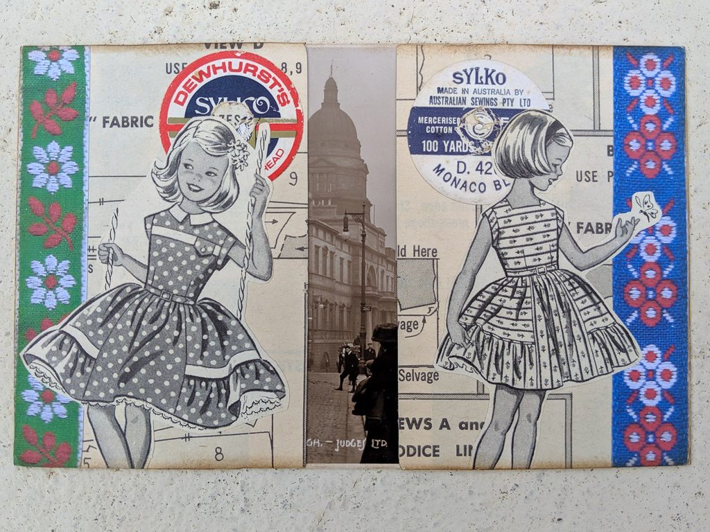
What I love about this one above by Fiona Kyle are a few things: First, the original vintage postcard as a substrate underneath and how you just get a peak of it between the ATCs. Second I love how these two cards are unique and could stand alone, and yet they complement each other with how they are composed using similar elements. So clever! Those illustrations of the girls are so cute.
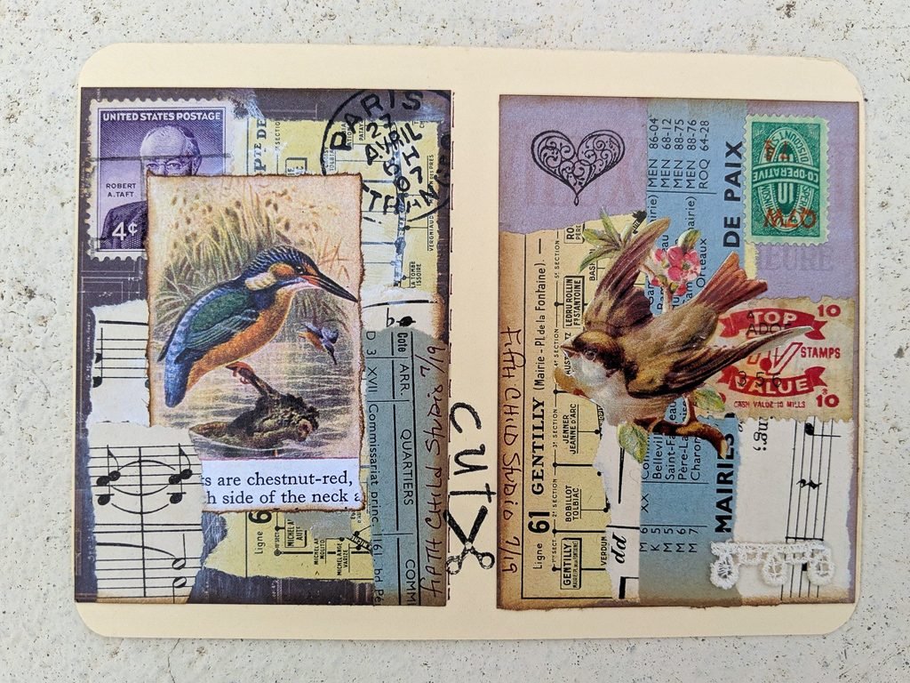
These two bird themed ATCs by Sara Hanlon are so different but make a great pair. I like the purple and blue colors shared across both pieces.
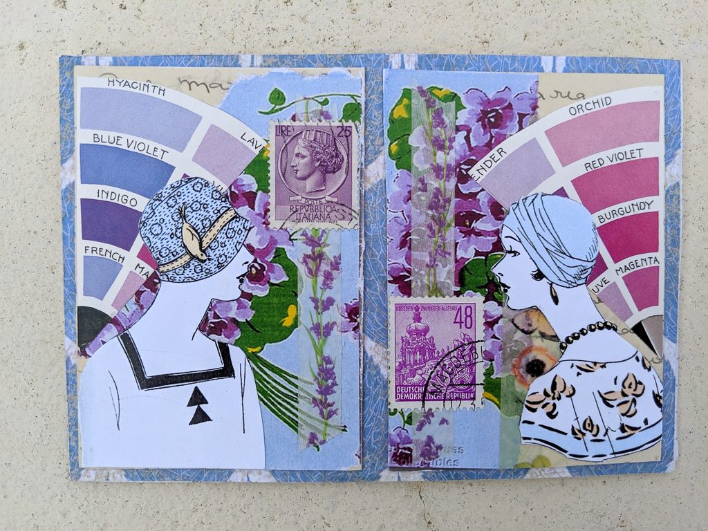
These above, by Michele Vass, play with a color wheel theme. Purples and blues are the colors of choice for these as well, with such a great balance of both color and paper choices.
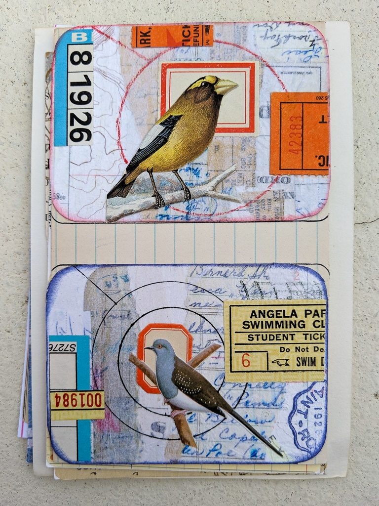
I'm not entirely sure what makes the birds stand out in these ATCs by Deborah Humphries. I think it has a lot to do with the circles as accents. I love how the tickets have been cut up and both pieces used in the composition. The muted background pieces are interesting too.
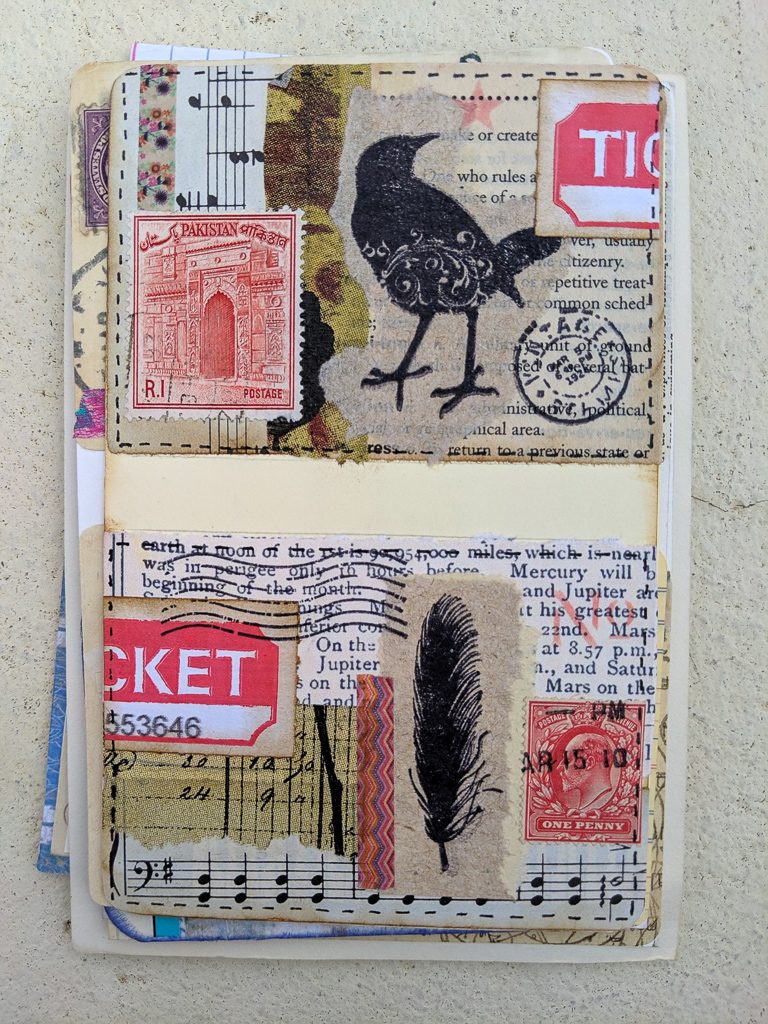
These two red-accented cards from Trudy Tantalo also use a ticket that has been cut into two pieces and shared over both ATCs. Again, there is a cohesiveness between these two that makes the card very appealing. The torn edges on some of the paper pieces really add a nice touch.
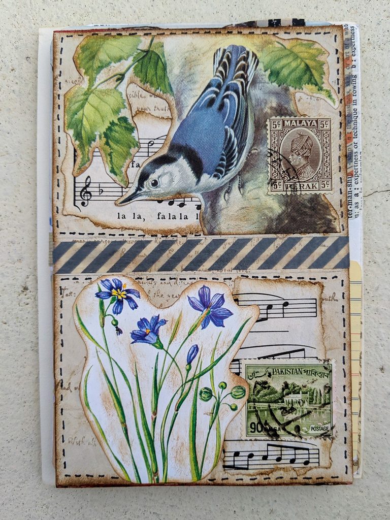
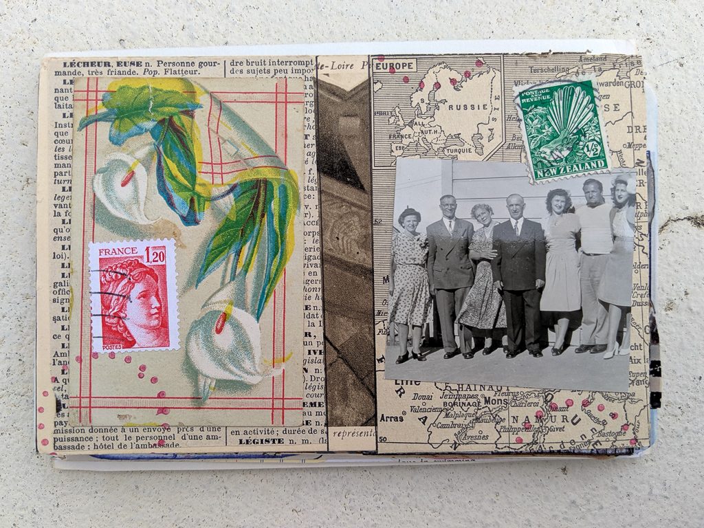
These nature-themed cards are from Diane Lewis. Great images and great postage stamps! You can't go wrong with that. Those dotted lines around the border of the cards really frames things beautifully. These are such sweet cards.
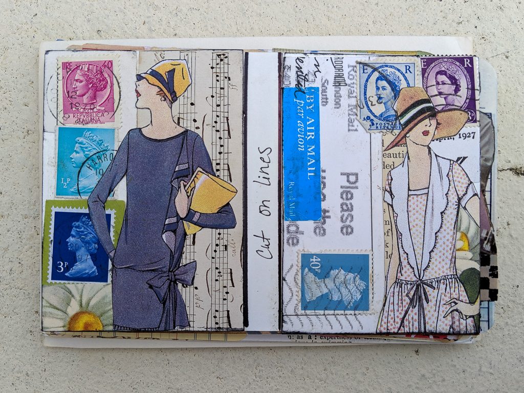
Above, Terry Macias did some great things with postage stamps and women's fashion! I love how these two ladies are looking in opposite directions. The fussy cutting along with the layering is quite effective.
It's interesting that even though these two ATCs above by Pamela Gerard don't have an obvious shared theme across both, the similarity in the colors of the papers as well as the colors of the postage stamps that complement the other paper choices, really bring these two together. I love how again, you can see a vintage postcard as substrate between the two.
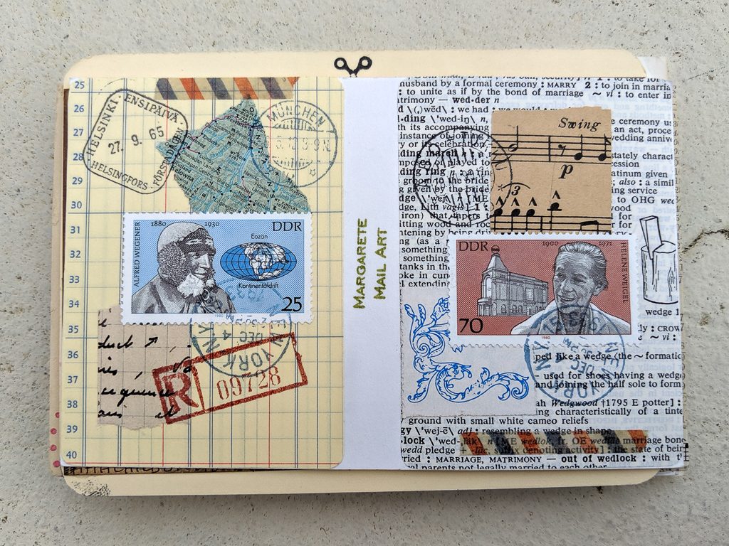
Lastly, below are my two submissions. I like pairing similar postage stamps and had these pairs set aside that I wanted to do something with. When I created these, I started with the stamps and worked out from there. 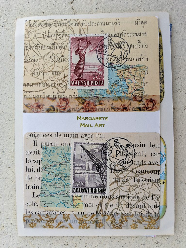
Thank you, everyone, who participated. I truly hope that enjoy the challenge of creating, and then look forward to receiving someone else's work in your mailbox. The next swap, single postcards, will be in October.